Note
Click here to download the full example code
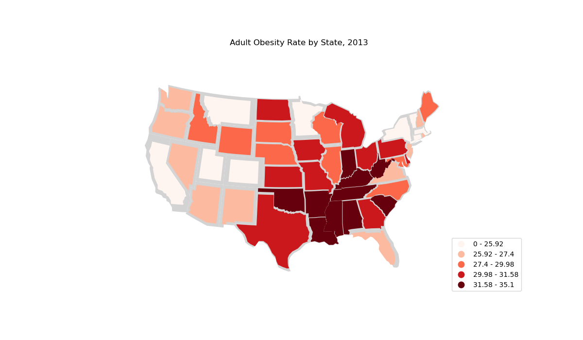
Cartogram of US states by obesity rate
This example cartogram showcases regional trends for obesity in the United States. Rugged
mountain states are the healthiest; the deep South, the unhealthiest.
This example inspired by the “Non-Contiguous Cartogram” example in the D3.JS example gallery.
Out:
Text(0.5, 1.0, 'Adult Obesity Rate by State, 2013')
import pandas as pd
import geopandas as gpd
import geoplot as gplt
import geoplot.crs as gcrs
import matplotlib.pyplot as plt
import mapclassify as mc

# load the data
obesity_by_state = pd.read_csv(gplt.datasets.get_path('obesity_by_state'), sep='\t')
contiguous_usa = gpd.read_file(gplt.datasets.get_path('contiguous_usa'))
contiguous_usa['Obesity Rate'] = contiguous_usa['state'].map(
    lambda state: obesity_by_state.query("State == @state").iloc[0]['Percent']
)
scheme = mc.Quantiles(contiguous_usa['Obesity Rate'], k=5)


ax = gplt.cartogram(
    contiguous_usa,
    scale='Obesity Rate', limits=(0.75, 1),
    projection=gcrs.AlbersEqualArea(central_longitude=-98, central_latitude=39.5),
    hue='Obesity Rate', cmap='Reds', scheme=scheme,
    linewidth=0.5,
    legend=True, legend_kwargs={'loc': 'lower right'}, legend_var='hue',
    figsize=(12, 7)
)
gplt.polyplot(contiguous_usa, facecolor='lightgray', edgecolor='None', ax=ax)

plt.title("Adult Obesity Rate by State, 2013")
Total running time of the script: ( 0 minutes 0.625 seconds)