Customizing Plots
geoplot plots have a large number of styling parameters, both cosmetic (for example, the colors of the map borders) and informative (for example, the choice of colormap). This section of the tutorial explains how these work.
You may follow along with this tutorial interactively using Binder.
Position
A visual variable is an attribute of a plot that is used to convey information. One such variable that every map has in common is position.
[1]:
%matplotlib inline
import geopandas as gpd
import geoplot as gplt

continental_usa_cities = gpd.read_file(gplt.datasets.get_path('usa_cities'))
continental_usa_cities = continental_usa_cities.query('STATE not in ["AK", "HI", "PR"]')
contiguous_usa = gpd.read_file(gplt.datasets.get_path('contiguous_usa'))
[2]:
import geoplot.crs as gcrs

ax = gplt.webmap(contiguous_usa, projection=gcrs.WebMercator())
gplt.pointplot(continental_usa_cities, ax=ax)
[2]:
<cartopy.mpl.geoaxes.GeoAxesSubplot at 0x12beeeda0>
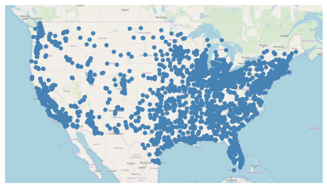
This plot shows cities in the continental United States with greater than 10,000 population. It has only one visual variable, position. By examining the distribution of the points, we see that the part of the United States around the Rocky Mountains is more sparely populated than the coasts.
Hue
The “hue” parameter in geoplot adds color as a visual variable in your plot.
This parameter is called “hue”, not “color”, because
coloris a reserved keyword in thematplotlibAPI.
[3]:
ax = gplt.webmap(contiguous_usa, projection=gcrs.WebMercator())
gplt.pointplot(
    continental_usa_cities,
    hue='ELEV_IN_FT',
    ax=ax
)
[3]:
<cartopy.mpl.geoaxes.GeoAxesSubplot at 0x12bfb88d0>
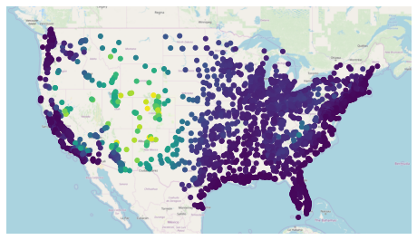
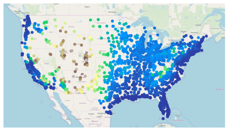
In this case we set hue='ELEV_IN_FT', telling geoplot to color the points based on mean elevation.
There are two ways of assigning colors to geometries: a continuous colormap, which just applies colors on a spectrum of data; or a categorical colormap, which buckets data and applies colors not to those buckets.
geoplot uses a continuous colormap by default. To switch to a categorical colormap, use the scheme parameter:
[4]:
import mapclassify as mc
scheme = mc.Quantiles(continental_usa_cities['ELEV_IN_FT'], k=5)

ax = gplt.webmap(contiguous_usa, projection=gcrs.WebMercator())
gplt.pointplot(
    continental_usa_cities,
    hue='ELEV_IN_FT', scheme=scheme,
    ax=ax
)
/Users/alex/miniconda3/envs/geoplot-dev/lib/python3.6/site-packages/scipy/stats/stats.py:1633: FutureWarning: Using a non-tuple sequence for multidimensional indexing is deprecated; use `arr[tuple(seq)]` instead of `arr[seq]`. In the future this will be interpreted as an array index, `arr[np.array(seq)]`, which will result either in an error or a different result.
  return np.add.reduce(sorted[indexer] * weights, axis=axis) / sumval
[4]:
<cartopy.mpl.geoaxes.GeoAxesSubplot at 0x12bfddeb8>
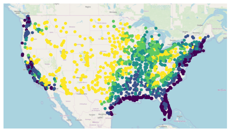
The mapclassify library has a rich list of categorical colormaps to choose from. it is also possible to specify your own custom classification scheme. Refer to the California districts demo in the Gallery for more information.
geoplot uses the viridis colormap by default. To specify an alternative colormap, use the cmap parameter:
[5]:
ax = gplt.webmap(contiguous_usa, projection=gcrs.WebMercator())
gplt.pointplot(
    continental_usa_cities,
    hue='ELEV_IN_FT', cmap='terrain',
    ax=ax
)
[5]:
<cartopy.mpl.geoaxes.GeoAxesSubplot at 0x12c832d30>
There are over fifty named colormaps in matplotlib—the reference page has the full list. It is also possible to create your own colormap. Refer to the Napoleon’s march on Moscow example in the Gallery for an example.
Power User Feature: Colormap Normalization
Colormap normalization is supported in geoplot via the norm parameter.
Scale
Another visual variable present in some plots in geoplot is scale.
[29]:
large_continental_usa_cities = continental_usa_cities.query('POP_2010 > 100000')

ax = gplt.webmap(contiguous_usa, projection=gcrs.WebMercator())
gplt.pointplot(
    large_continental_usa_cities, projection=gcrs.AlbersEqualArea(),
    scale='POP_2010', limits=(4, 50),
    ax=ax
)
[29]:
<cartopy.mpl.geoaxes.GeoAxesSubplot at 0x12dd552b0>
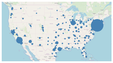
Scale uses the size of the feature to communication information about its magnitude. For example in this plot we can see more easily than in the hue-based plots how much larger certain cities (like New York City and Los Angeles) are than others.
You can adjust the minimum and maximum size of the of the plot elements to your liking using the limits parameter.
Power User Feature: Custom Scaling Functions
geoplotuses a linear scale by default. To use a different scale, like e.g. logarithmic, pass a scaling function to thescale_funcparameter. Refer to the USA city elevations demo in the Gallery for an example.
Legend
A legend provides a reference on the values that correspond to the visual variables in your plot. Legends are an important feature because they make your map interpretable. Without a legend, you can only map visual variables to relative magnitudes. With a legend, you can further map them to actual ranges of values.
To add a legend to your plot, set legend=True.
[28]:
import mapclassify as mc
scheme = mc.Quantiles(large_continental_usa_cities['POP_2010'], k=5)

ax = gplt.webmap(contiguous_usa, projection=gcrs.WebMercator())
gplt.pointplot(
    large_continental_usa_cities, projection=gcrs.AlbersEqualArea(),
    scale='POP_2010', limits=(4, 50),
    hue='POP_2010', cmap='viridis', scheme=scheme,
    legend=True, legend_var='hue',
    ax=ax
)
/Users/alex/miniconda3/envs/geoplot-dev/lib/python3.6/site-packages/scipy/stats/stats.py:1633: FutureWarning: Using a non-tuple sequence for multidimensional indexing is deprecated; use `arr[tuple(seq)]` instead of `arr[seq]`. In the future this will be interpreted as an array index, `arr[np.array(seq)]`, which will result either in an error or a different result.
  return np.add.reduce(sorted[indexer] * weights, axis=axis) / sumval
[28]:
<cartopy.mpl.geoaxes.GeoAxesSubplot at 0x135c57e80>
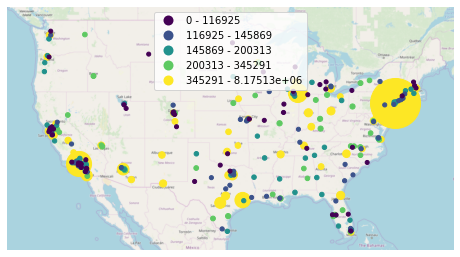
The type of legend you will get depends on your configuration options. There are three different kinds. This example demonstrates a categorical colormap legend. If your colormap is continuous (e.g. scheme=None; see the section on Hue), a continuous colorbar will be used instead:
[32]:
ax = gplt.webmap(contiguous_usa, projection=gcrs.WebMercator())
gplt.pointplot(
    large_continental_usa_cities, projection=gcrs.AlbersEqualArea(),
    scale='POP_2010', limits=(2, 30),
    hue='POP_2010', cmap='viridis',
    legend=True,
    ax=ax
)
/Users/alex/Desktop/geoplot/geoplot/geoplot.py:258: UserWarning: Please specify "legend_var" explicitly when both "hue" and "scale" are specified. Defaulting to "legend_var='hue'".
  f'Please specify "legend_var" explicitly when both "hue" and "scale" are '
[32]:
<cartopy.mpl.geoaxes.GeoAxesSubplot at 0x1347b5d30>
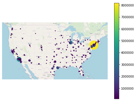
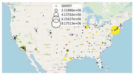
Alternatively, set legend_var='scale' to use a scale legend instead:
[33]:
ax = gplt.webmap(contiguous_usa, projection=gcrs.WebMercator())
gplt.pointplot(
    large_continental_usa_cities, projection=gcrs.AlbersEqualArea(),
    scale='POP_2010', limits=(2, 30),
    hue='POP_2010', cmap='viridis', scheme=scheme,
    legend=True, legend_var='scale',
    ax=ax
)
[33]:
<cartopy.mpl.geoaxes.GeoAxesSubplot at 0x13755dda0>
You can fine-tune the appearance of the legend using legend_kwargs parameter. The list of values this parameter accepts depends on the legend type. In the case of a categorical colormap legend or a scale legend, a matplotlib Legend is used, whose keyword options are listed in the matplotlib documentation. In the case of a colorbar legend, the keyword parameters allowed are listed in a different page in
the matplotlib documentation.
Here is an example using legend_kwargs parameters to reposition the legend:
[40]:
ax = gplt.webmap(contiguous_usa, projection=gcrs.WebMercator())
gplt.pointplot(
    large_continental_usa_cities, projection=gcrs.AlbersEqualArea(),
    scale='POP_2010', limits=(2, 30),
    hue='POP_2010', cmap='viridis', scheme=scheme,
    legend=True, legend_var='scale',
    legend_kwargs={'bbox_to_anchor': (1, 0.35), 'frameon': False},
    legend_values=[8000000, 6000000, 4000000, 2000000, 100000],
    legend_labels=['8 million', '6 million', '4 million', '2 million', '100 thousand'],
    ax=ax
)
[40]:
<cartopy.mpl.geoaxes.GeoAxesSubplot at 0x13969c4a8>
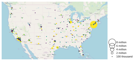
This example also demonstrates the use of the legend_values and legend_labels parameters to customize the markers and labels in the legend, respectively.
Power User Feature: Custom Legend Markers
Keyword arguments to
legend_kwargsthat start withmarker(e.g.marker,markeredgecolor,markeredgewidth,markerfacecolor, andmarkersize) will be passed through the legend down to the legend markers.
Extent
The extent of a plot is the span of its axes. In geoplot it is formatted as a tuple of (min_longitude, min_latitude, max_longitude, max_latitude). For example, a plot covering the entire world would have a span of (-180, -180, 180, 180).
The extent argument can be used to set the extent of a plot manually. This can be used to change the focus of a map. For example, here’s a map of just populous cities in the state of California.
[46]:
import mapclassify as mc
scheme = mc.Quantiles(large_continental_usa_cities['POP_2010'], k=5)

extent = contiguous_usa.query('state == "California"').total_bounds
ax = gplt.pointplot(
    large_continental_usa_cities, projection=gcrs.WebMercator(),
    scale='POP_2010', limits=(5, 100),
    hue='POP_2010', scheme=scheme, cmap='viridis'
)
gplt.webmap(
    contiguous_usa, ax=ax, extent=extent
)
/Users/alex/miniconda3/envs/geoplot-dev/lib/python3.6/site-packages/scipy/stats/stats.py:1633: FutureWarning: Using a non-tuple sequence for multidimensional indexing is deprecated; use `arr[tuple(seq)]` instead of `arr[seq]`. In the future this will be interpreted as an array index, `arr[np.array(seq)]`, which will result either in an error or a different result.
  return np.add.reduce(sorted[indexer] * weights, axis=axis) / sumval
[46]:
<cartopy.mpl.geoaxes.GeoAxesSubplot at 0x13edeb550>
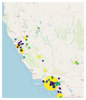
The total_bounds property on a GeoDataFrame, which returns the extent bounding box values for a given chunk of data, is extremely useful for this purpose.
Cosmetic parameters
Keyword arugments that are not interpreted as arguments to geoplot are instead passed directly to the underlying matplotlib chart instance. This means that all of the usual matplotlib plot customization options are there.
We won’t go over every single possible option here, but we will mention the most common parameters you will want to tweak:
edgecolor—Controls the color of the border lines.linewidth—Controls the width of the border lines.facecolor—Controls the color of the fill of the shape.
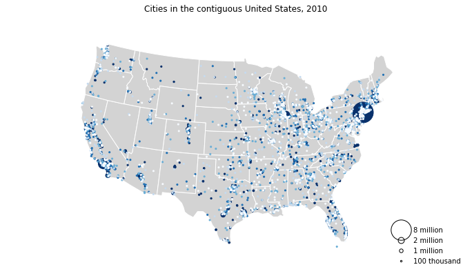
By combining all of the things we’ve learned thus far in this guide with a few matplotlib customizations we can generate some very pretty-looking plots:
[47]:
import geoplot.crs as gcrs
import matplotlib.pyplot as plt
import mapclassify as mc

scheme = mc.Quantiles(continental_usa_cities['POP_2010'], k=5)
proj = gcrs.AlbersEqualArea()

ax = gplt.polyplot(
    contiguous_usa,
    zorder=-1,
    linewidth=1,
    projection=proj,
    edgecolor='white',
    facecolor='lightgray',
    figsize=(12, 12)
)

gplt.pointplot(
    continental_usa_cities,
    scale='POP_2010',
    limits=(2, 30),
    hue='POP_2010',
    cmap='Blues',
    scheme=scheme,
    legend=True,
    legend_var='scale',
    legend_values=[8000000, 2000000, 1000000, 100000],
    legend_labels=['8 million', '2 million', '1 million', '100 thousand'],
    legend_kwargs={'frameon': False, 'loc': 'lower right'},
    ax=ax
)

plt.title("Cities in the contiguous United States, 2010")
/Users/alex/miniconda3/envs/geoplot-dev/lib/python3.6/site-packages/scipy/stats/stats.py:1633: FutureWarning: Using a non-tuple sequence for multidimensional indexing is deprecated; use `arr[tuple(seq)]` instead of `arr[seq]`. In the future this will be interpreted as an array index, `arr[np.array(seq)]`, which will result either in an error or a different result.
  return np.add.reduce(sorted[indexer] * weights, axis=axis) / sumval
[47]:
Text(0.5, 1.0, 'Cities in the contiguous United States, 2010')