Plot Reference
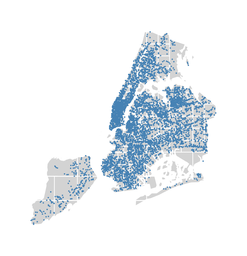
Pointplot
The pointplot is a geospatial scatter plot that represents each observation in your dataset
as a single point on a map. It is simple and easily interpretable plot, making it an ideal
choice for showing simple pointwise relationships between observations.
pointplot requires, at a minimum, some points for plotting:
import geoplot as gplt
import geoplot.crs as gcrs
import geopandas as gpd
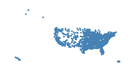
cities = gpd.read_file(gplt.datasets.get_path('usa_cities'))
gplt.pointplot(cities)
(Source code, png, hires.png, pdf)
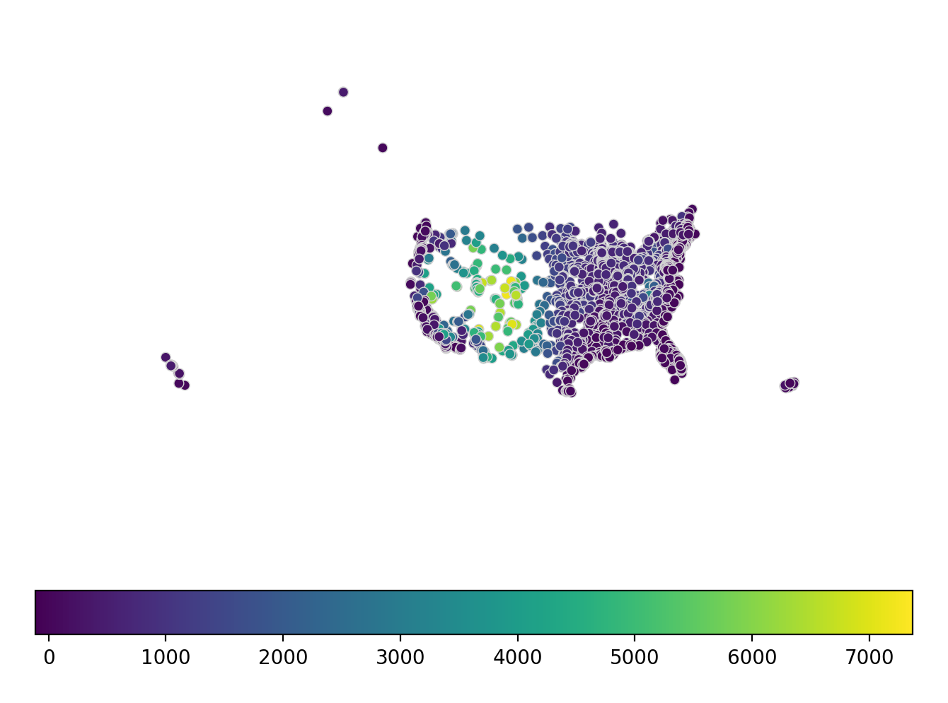
The hue parameter applies a colormap to a data column. The legend parameter toggles a
legend.
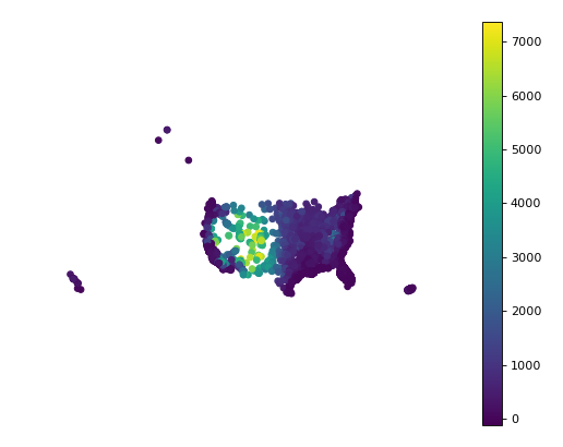
gplt.pointplot(cities, projection=gcrs.AlbersEqualArea(), hue='ELEV_IN_FT', legend=True)
(Source code, png, hires.png, pdf)
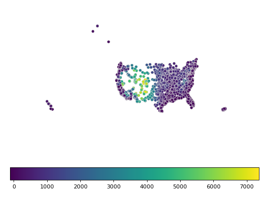
Change the colormap using cmap. For a categorical colormap, use scheme.
import mapclassify as mc
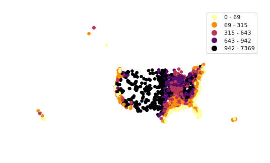
scheme = mc.Quantiles(cities['ELEV_IN_FT'], k=5)
gplt.pointplot(
cities, projection=gcrs.AlbersEqualArea(),
hue='ELEV_IN_FT', scheme=scheme, cmap='inferno_r',
legend=True
)
(Source code, png, hires.png, pdf)

Keyword arguments that are not part of the geoplot API are passed to the underlying
matplotlib.pyplot.scatter instance,
which can be used to customize the appearance of the
plot. To pass keyword argument to the legend, use the legend_kwargs argument.
gplt.pointplot(
    cities, projection=gcrs.AlbersEqualArea(),
    hue='ELEV_IN_FT',
    legend=True, legend_kwargs={'orientation': 'horizontal'},
    edgecolor='lightgray', linewidth=0.5
)
(Source code, png, hires.png, pdf)
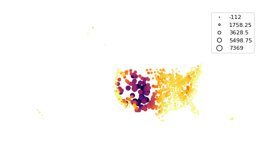
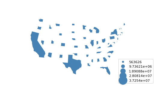
scale provides an alternative or additional visual variable. The minimum and maximum size
of the points can be adjusted to fit your data using the limits parameter. It is often
benefitial to combine both scale and hue in a single plot. In this case, you can use
the legend_var variable to control which visual variable the legend is keyed on.
gplt.pointplot(
    cities, projection=gcrs.AlbersEqualArea(),
    hue='ELEV_IN_FT', scale='ELEV_IN_FT', limits=(1, 10), cmap='inferno_r',
    legend=True, legend_var='scale'
)
(Source code, png, hires.png, pdf)

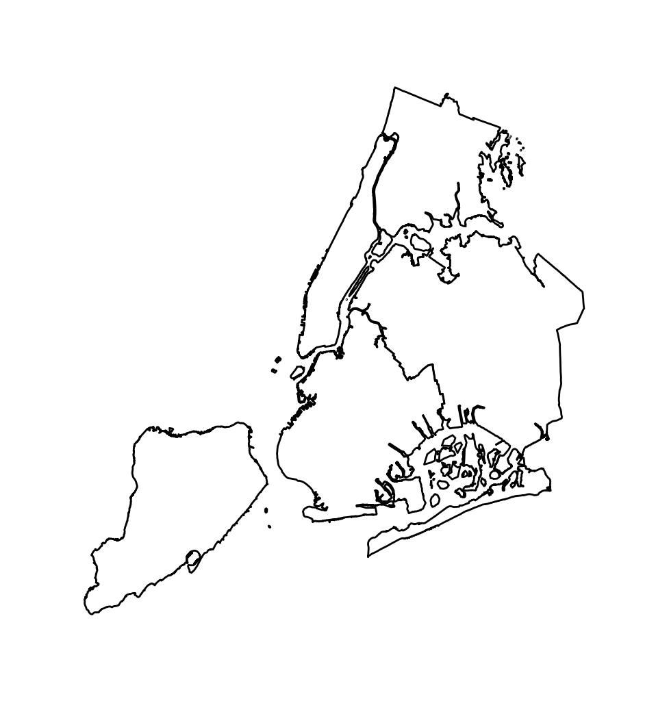
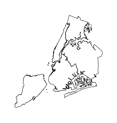
Polyplot
The polyplot draws polygons on a map.
import geoplot as gplt
import geoplot.crs as gcrs
import geopandas as gpd

boroughs = gpd.read_file(gplt.datasets.get_path('nyc_boroughs'))
gplt.polyplot(boroughs, projection=gcrs.AlbersEqualArea())
(Source code, png, hires.png, pdf)
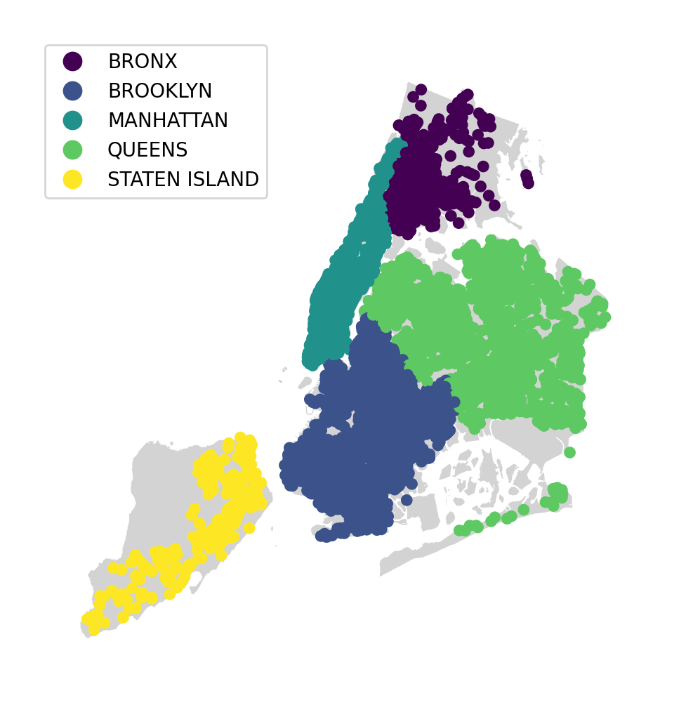
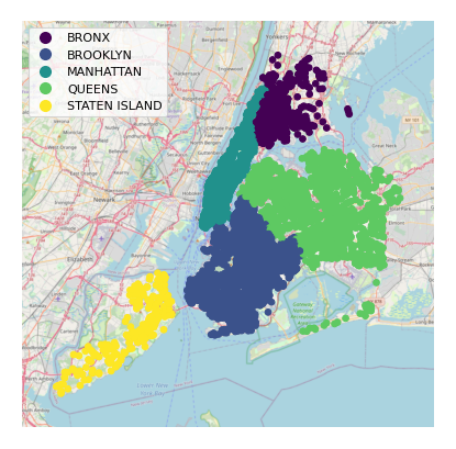
polyplot is intended to act as a basemap for other, more interesting plot types.
collisions = gpd.read_file(gplt.datasets.get_path('nyc_collision_factors'))
ax = gplt.polyplot(
boroughs, projection=gcrs.AlbersEqualArea(),
edgecolor='None', facecolor='lightgray'
)
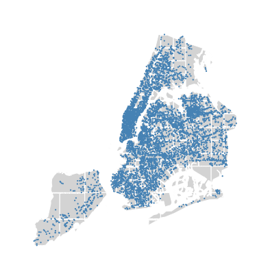
gplt.pointplot(
collisions[collisions['BOROUGH'].notnull()],
hue='BOROUGH', ax=ax, legend=True
)
(Source code, png, hires.png, pdf)

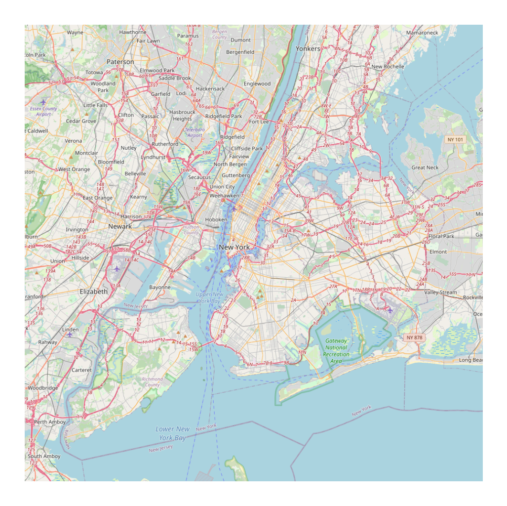
Webmap
The webmap creates a static webmap.
import geoplot as gplt
import geoplot.crs as gcrs
import geopandas as gpd

boroughs = gpd.read_file(gplt.datasets.get_path('nyc_boroughs'))

gplt.webmap(boroughs, projection=gcrs.WebMercator())
(Source code, png, hires.png, pdf)
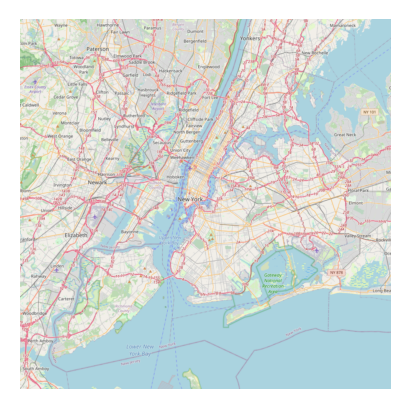
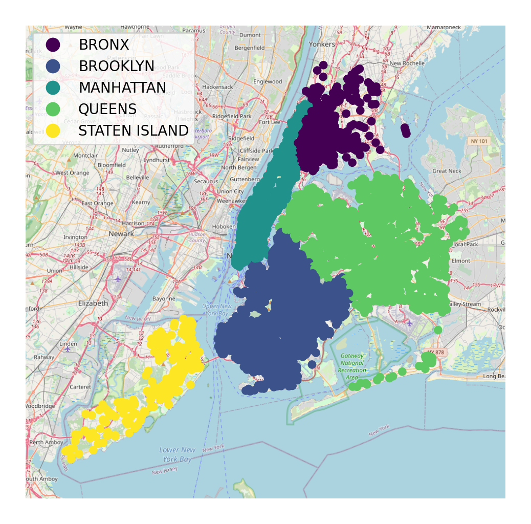
webmap is intended to act as a basemap for other plot types.
collisions = gpd.read_file(gplt.datasets.get_path('nyc_collision_factors'))

ax = gplt.webmap(boroughs, projection=gcrs.WebMercator())
gplt.pointplot(
    collisions[collisions['BOROUGH'].notnull()],
    hue='BOROUGH', ax=ax, legend=True
)
(Source code, png, hires.png, pdf)

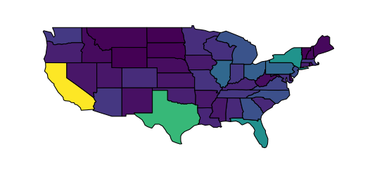
Choropleth
A choropleth takes observations that have been aggregated on some meaningful polygonal level (e.g. census tract, state, country, or continent) and displays the data to the reader using color. It is a well-known plot type, and likeliest the most general-purpose and well-known of the specifically spatial plot types.
A basic choropleth requires polygonal geometries and a hue variable.
import geoplot as gplt
import geoplot.crs as gcrs
import geopandas as gpd
contiguous_usa = gpd.read_file(gplt.datasets.get_path('contiguous_usa'))
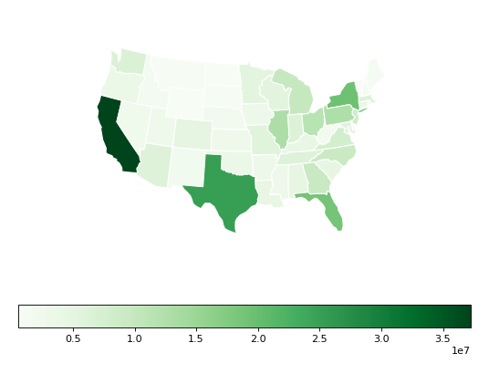
gplt.choropleth(contiguous_usa, hue='population')
(Source code, png, hires.png, pdf)
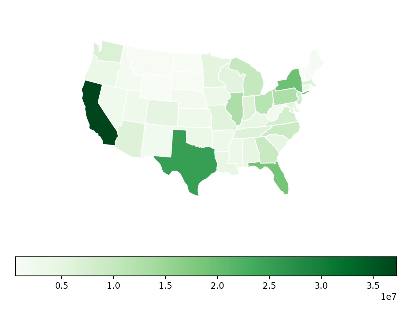
Change the colormap using cmap. The legend parameter toggles the legend.
gplt.choropleth(
    contiguous_usa, hue='population', projection=gcrs.AlbersEqualArea(),
    cmap='Greens', legend=True
)
(Source code, png, hires.png, pdf)
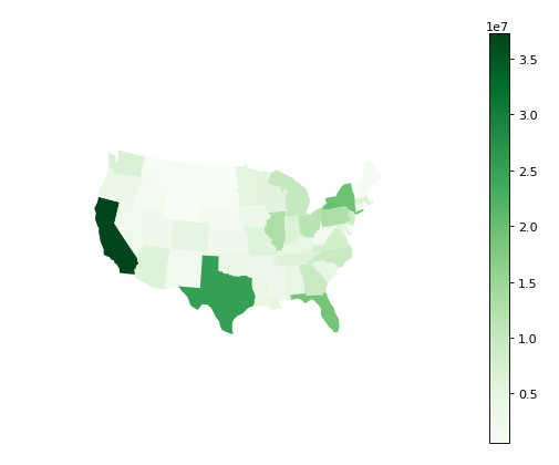

Keyword arguments that are not part of the geoplot API are passed to the underlying
matplotlib.patches.Polygon objects; this can be used to control plot aesthetics. To pass
keyword argument to the legend, use the legend_kwargs argument.
gplt.choropleth(
    contiguous_usa, hue='population', projection=gcrs.AlbersEqualArea(),
    edgecolor='white', linewidth=1,
    cmap='Greens', legend=True, legend_kwargs={'orientation': 'horizontal'}
)
(Source code, png, hires.png, pdf)
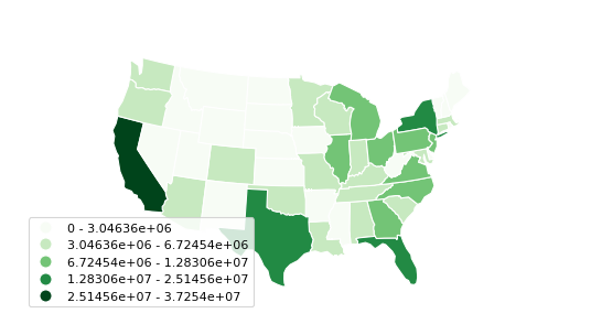
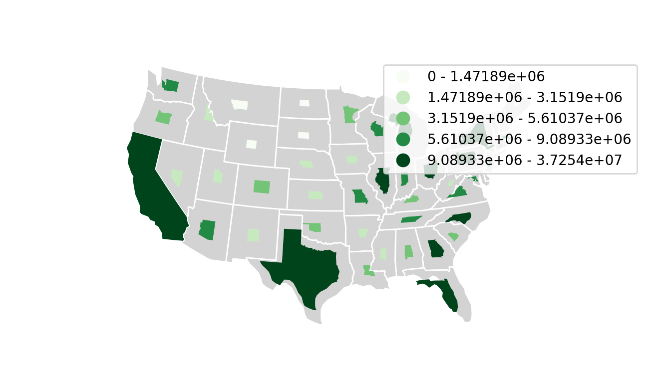
To specify a categorical colormap, use scheme.
import mapclassify as mc

scheme = mc.FisherJenks(contiguous_usa['population'], k=5)
gplt.choropleth(
    contiguous_usa, hue='population', projection=gcrs.AlbersEqualArea(),
    edgecolor='white', linewidth=1,
    cmap='Greens',
    legend=True, legend_kwargs={'loc': 'lower left'},
    scheme=scheme
)
(Source code, png, hires.png, pdf)
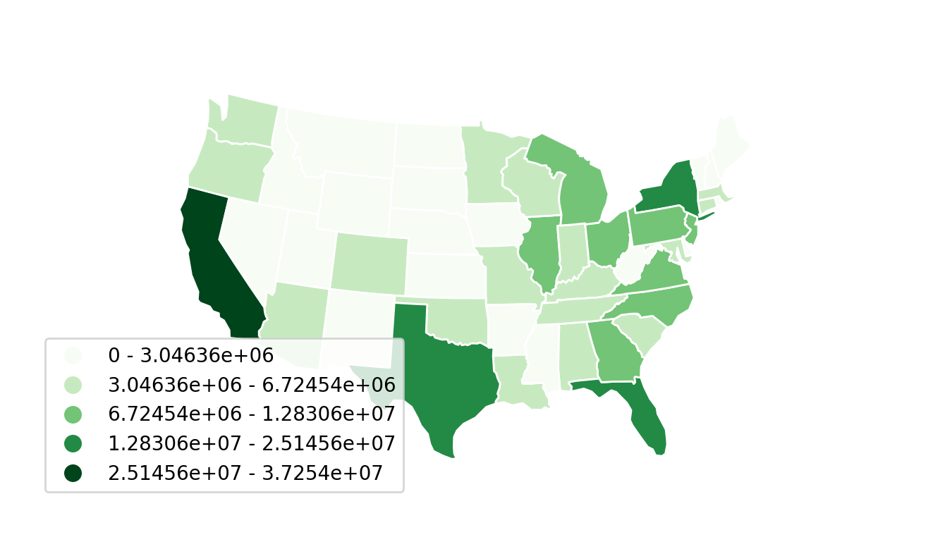
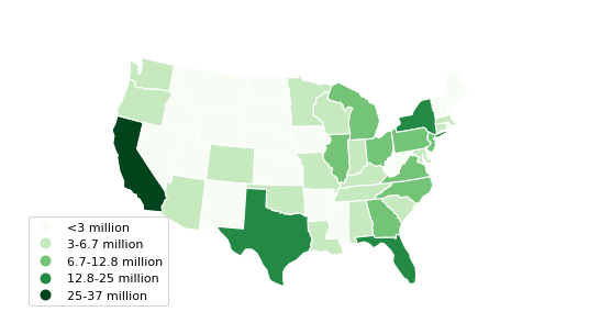
Use legend_labels and legend_values to customize the labels and values that appear
in the legend.
import mapclassify as mc

scheme = mc.FisherJenks(contiguous_usa['population'], k=5)
gplt.choropleth(
    contiguous_usa, hue='population', projection=gcrs.AlbersEqualArea(),
    edgecolor='white', linewidth=1,
    cmap='Greens', legend=True, legend_kwargs={'loc': 'lower left'},
    scheme=scheme,
    legend_labels=[
        '<3 million', '3-6.7 million', '6.7-12.8 million',
        '12.8-25 million', '25-37 million'
    ]
)
(Source code, png, hires.png, pdf)

KDEPlot
Kernel density estimation is a technique that non-parameterically estimates a distribution function for a sample of point observations. KDEs are a popular tool for analyzing data distributions; this plot applies this technique to the geospatial setting.
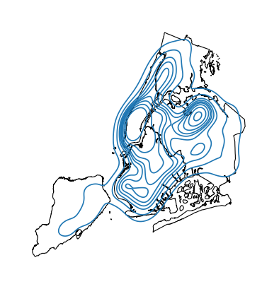
A basic kdeplot takes pointwise data as input. For interpretability, let’s also plot the
underlying borough geometry.
import geoplot as gplt
import geoplot.crs as gcrs
import geopandas as gpd

boroughs = gpd.read_file(gplt.datasets.get_path('nyc_boroughs'))
collisions = gpd.read_file(gplt.datasets.get_path('nyc_collision_factors'))

ax = gplt.polyplot(boroughs, projection=gcrs.AlbersEqualArea())
gplt.kdeplot(collisions, ax=ax)
(Source code, png, hires.png, pdf)

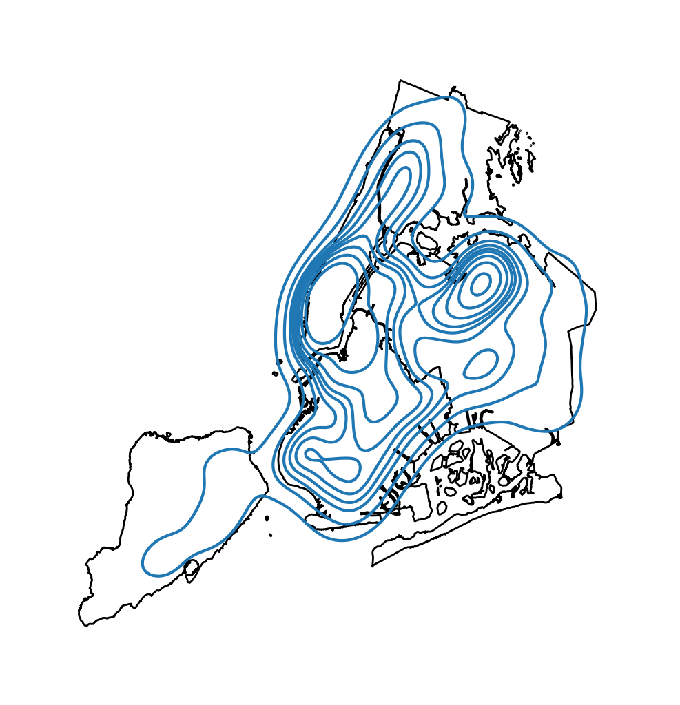
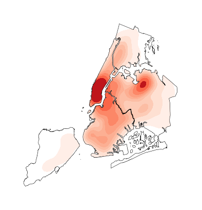
n_levels controls the number of isochrones. cmap control the colormap.
ax = gplt.polyplot(boroughs, projection=gcrs.AlbersEqualArea())
gplt.kdeplot(collisions, n_levels=20, cmap='Reds', ax=ax)
(Source code, png, hires.png, pdf)
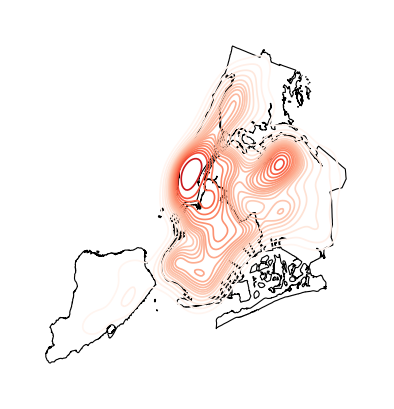
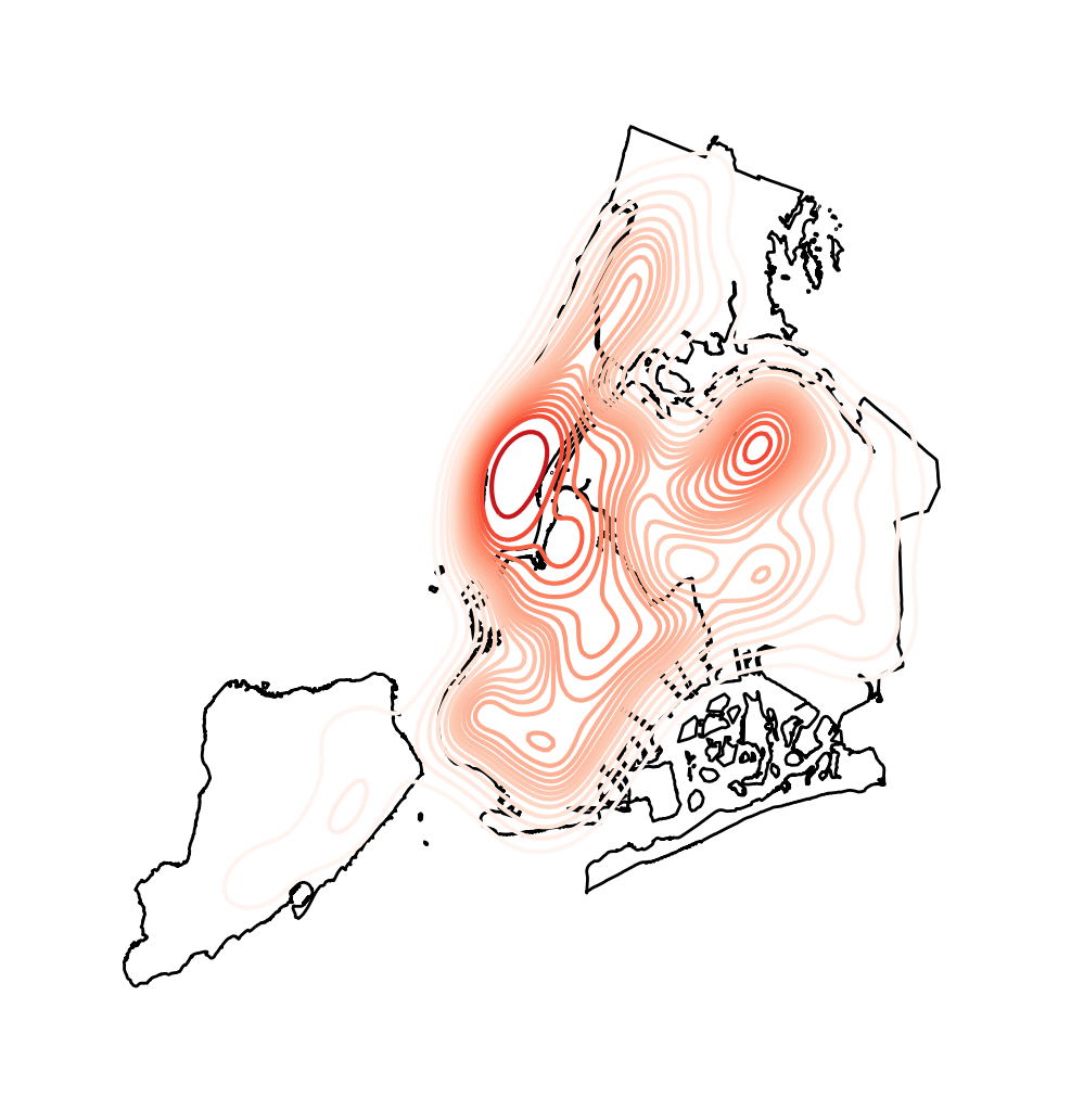
shade toggles shaded isochrones. Use clip to constrain the plot to the surrounding
geometry.
ax = gplt.polyplot(boroughs, projection=gcrs.AlbersEqualArea(), zorder=1)
gplt.kdeplot(collisions, cmap='Reds', shade=True, clip=boroughs, ax=ax)
(Source code, png, hires.png, pdf)

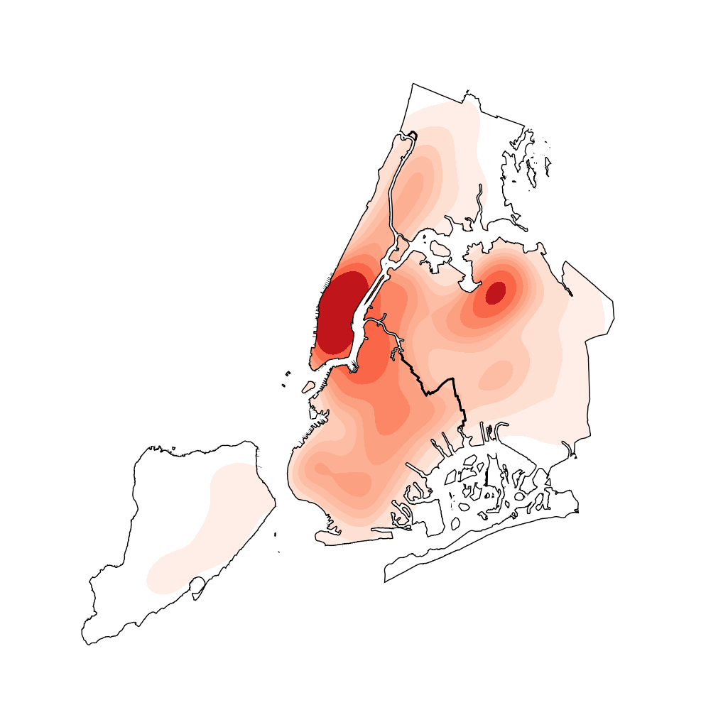
Additional keyword arguments that are not part of the geoplot API are passed to
the underlying seaborn.kdeplot instance.
One of the most useful of these parameters is thresh=0.05, which toggles shading on the
lowest (basal) layer of the kernel density estimate.
ax = gplt.polyplot(boroughs, projection=gcrs.AlbersEqualArea(), zorder=1)
gplt.kdeplot(collisions, cmap='Reds', shade=True, thresh=0.05,
             clip=boroughs, ax=ax)
(Source code, png, hires.png, pdf)

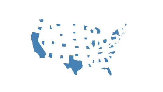
Cartogram
A cartogram distorts (grows or shrinks) polygons on a map according to the magnitude of some
input data. A basic cartogram specifies data, a projection, and a scale parameter.
import geoplot as gplt
import geoplot.crs as gcrs
import geopandas as gpd

contiguous_usa = gpd.read_file(gplt.datasets.get_path('contiguous_usa'))

gplt.cartogram(contiguous_usa, scale='population', projection=gcrs.AlbersEqualArea())
(Source code, png, hires.png, pdf)
Toggle the legend with legend. Keyword arguments can be passed to the legend using the
legend_kwargs argument. These arguments will be passed to the underlying legend.
gplt.cartogram(
    contiguous_usa, scale='population', projection=gcrs.AlbersEqualArea(),
    legend=True, legend_kwargs={'loc': 'lower right'}
)
(Source code, png, hires.png, pdf)

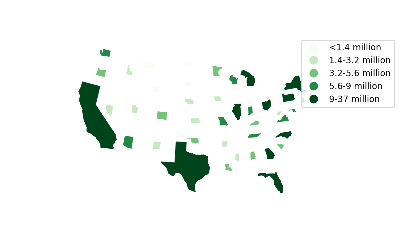
To add a colormap to the plot, specify hue. Use cmap to control the colormap. For a
categorical colormap, specify a scheme. In this plot we also add a backing outline of the
original state shapes, for better geospatial context.
import mapclassify as mc

scheme = mc.Quantiles(contiguous_usa['population'], k=5)
ax = gplt.cartogram(
    contiguous_usa, scale='population', projection=gcrs.AlbersEqualArea(),
    legend=True, legend_kwargs={'bbox_to_anchor': (1, 0.9)}, legend_var='hue',
    hue='population', scheme=scheme, cmap='Greens'
)
gplt.polyplot(contiguous_usa, facecolor='lightgray', edgecolor='white', ax=ax)
(Source code, png, hires.png, pdf)

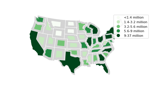
Use legend_labels and legend_values to customize the labels and values that appear
in the legend.
gplt.cartogram(
    contiguous_usa, scale='population', projection=gcrs.AlbersEqualArea(),
    legend=True, legend_kwargs={'bbox_to_anchor': (1, 0.9)}, legend_var='hue',
    hue='population', scheme=scheme, cmap='Greens',
    legend_labels=[
        '<1.4 million', '1.4-3.2 million', '3.2-5.6 million',
        '5.6-9 million', '9-37 million'
    ]
)
gplt.polyplot(contiguous_usa, facecolor='lightgray', edgecolor='white', ax=ax)
(Source code, png, hires.png, pdf)

Use the limits parameter to adjust the minimum and maximum scaling factors.
You can also pass a custom scaling function to scale_func to apply a
different scale to the plot (the default scaling function is linear); see the
Pointplot of US city elevations with custom scale functions for an example.
ax = gplt.cartogram(
    contiguous_usa, scale='population', projection=gcrs.AlbersEqualArea(),
    legend=True, legend_kwargs={'bbox_to_anchor': (1, 0.9)}, legend_var='hue',
    hue='population', scheme=scheme, cmap='Greens',
    legend_labels=[
        '<1.4 million', '1.4-3.2 million', '3.2-5.6 million',
        '5.6-9 million', '9-37 million'
    ],
    limits=(0.5, 1)
)
gplt.polyplot(contiguous_usa, facecolor='lightgray', edgecolor='white', ax=ax)
(Source code, png, hires.png, pdf)

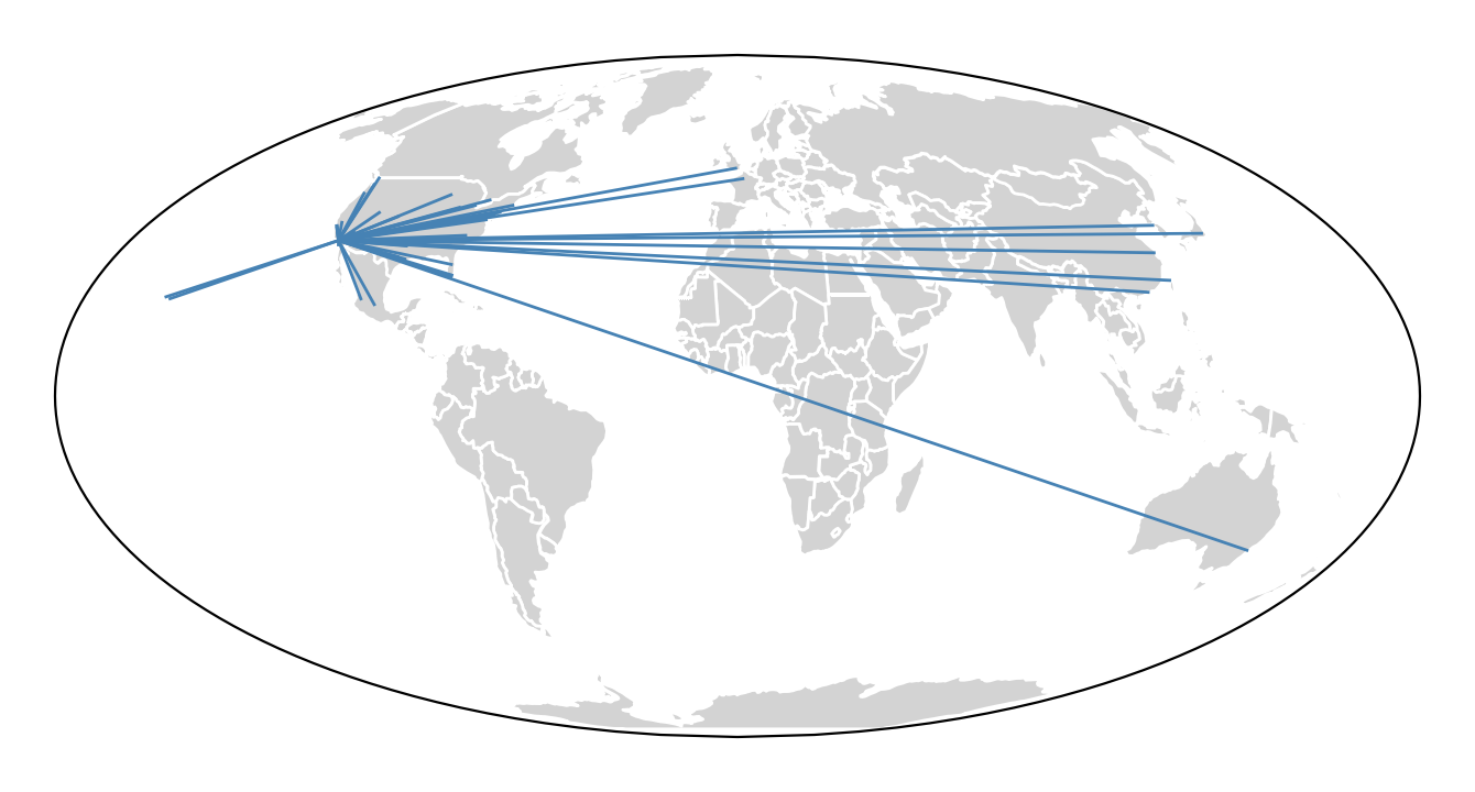
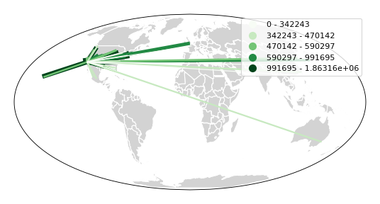
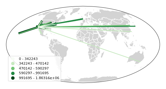
Sankey
A Sankey diagram visualizes flow through a network. It can be used to show the magnitudes of data moving through a system. This plot brings the Sankey diagram into the geospatial context; useful for analyzing traffic load a road network, for example, or travel volumes between different airports.
A basic sankey requires a GeoDataFrame of LineString or MultiPoint geometries.
For interpretability, these examples also include world geometry.
import geoplot as gplt
import geoplot.crs as gcrs
import geopandas as gpd

la_flights = gpd.read_file(gplt.datasets.get_path('la_flights'))
world = gpd.read_file(gplt.datasets.get_path('world'))

ax = gplt.sankey(la_flights, projection=gcrs.Mollweide())
gplt.polyplot(world, ax=ax, facecolor='lightgray', edgecolor='white')
ax.set_global(); ax.outline_patch.set_visible(True)
(Source code, png, hires.png, pdf)
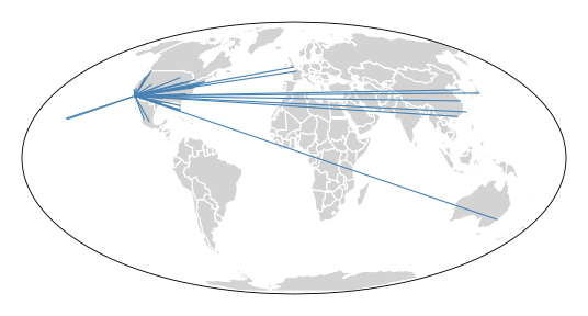
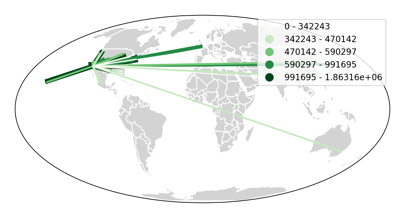
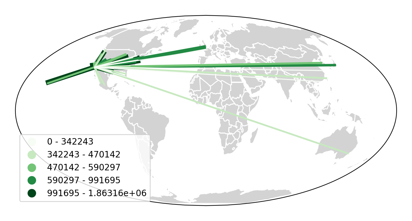
hue adds color gradation to the map. Use cmap to control the colormap. For a categorical
colormap, specify scheme. legend toggles a legend.
import mapclassify as mc

scheme = mc.Quantiles(la_flights['Passengers'], k=5)
ax = gplt.sankey(
    la_flights, projection=gcrs.Mollweide(),
    hue='Passengers', cmap='Greens', scheme=scheme, legend=True
)
gplt.polyplot(
    world, ax=ax, facecolor='lightgray', edgecolor='white'
)
ax.set_global(); ax.outline_patch.set_visible(True)
(Source code, png, hires.png, pdf)

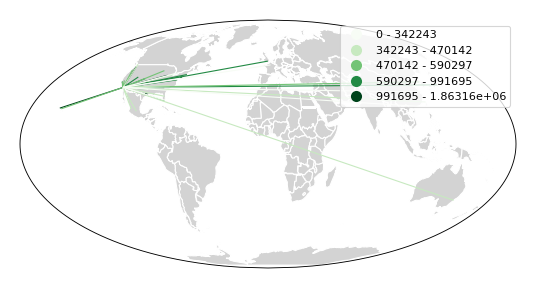
scale adds volumetric scaling to the plot. limits can be used to control the minimum
and maximum line width.
import mapclassify as mc

scheme = mc.Quantiles(la_flights['Passengers'], k=5)
ax = gplt.sankey(
    la_flights, projection=gcrs.Mollweide(),
    scale='Passengers', limits=(1, 10),
    hue='Passengers', cmap='Greens', scheme=scheme, legend=True
)
gplt.polyplot(
    world, ax=ax, facecolor='lightgray', edgecolor='white'
)
ax.set_global(); ax.outline_patch.set_visible(True)
(Source code, png, hires.png, pdf)

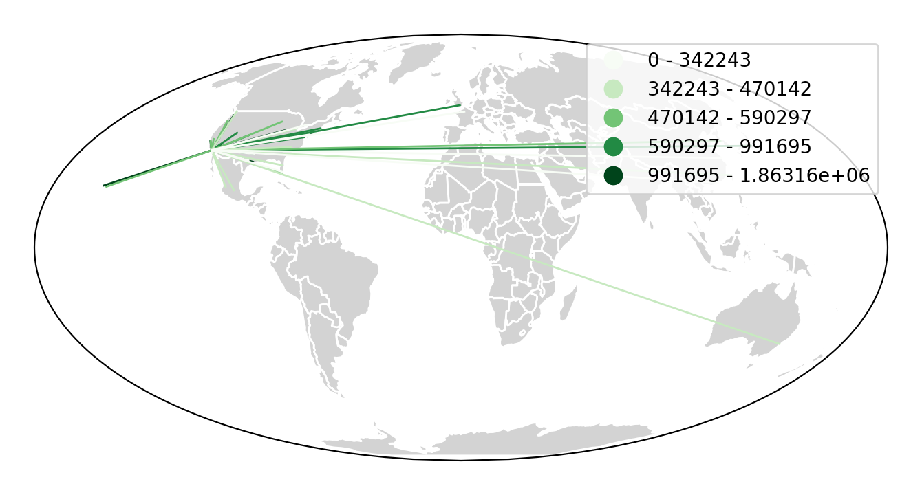
Keyword arguments can be passed to the legend using the legend_kwargs argument. These
arguments will be passed to the underlying legend.
import mapclassify as mc

scheme = mc.Quantiles(la_flights['Passengers'], k=5)
ax = gplt.sankey(
    la_flights, projection=gcrs.Mollweide(),
    scale='Passengers', limits=(1, 10),
    hue='Passengers', scheme=scheme, cmap='Greens',
    legend=True, legend_kwargs={'loc': 'lower left'}
)
gplt.polyplot(
    world, ax=ax, facecolor='lightgray', edgecolor='white'
)
ax.set_global(); ax.outline_patch.set_visible(True)
(Source code, png, hires.png, pdf)

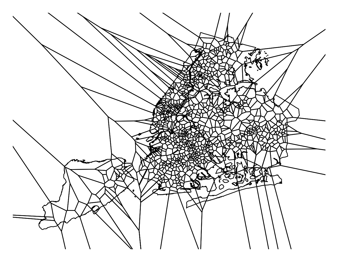
Voronoi
The Voronoi region of an point is the set of points which is closer to that point than to any other observation in a dataset. A Voronoi diagram is a space-filling diagram that constructs all of the Voronoi regions of a dataset and plots them.
Voronoi plots are efficient for judging point density and, combined with colormap, can be used to infer regional trends in a set of data.
A basic voronoi specifies some point data. We overlay geometry to aid interpretability.
import geoplot as gplt
import geoplot.crs as gcrs
import geopandas as gpd

boroughs = gpd.read_file(gplt.datasets.get_path('nyc_boroughs'))
injurious_collisions = gpd.read_file(gplt.datasets.get_path('nyc_injurious_collisions'))

ax = gplt.voronoi(injurious_collisions.head(1000))
gplt.polyplot(boroughs, ax=ax)
(Source code, png, hires.png, pdf)
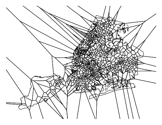
Use clip to clip the result to surrounding geometry. This is recommended in most cases.
Note that if the clip geometry is complicated, this operation will take a long time; consider
simplifying complex geometries with simplify to speed it up.
ax = gplt.voronoi(
    injurious_collisions.head(100),
    clip=boroughs.simplify(0.001), projection=gcrs.AlbersEqualArea()
)
gplt.polyplot(boroughs, ax=ax)
(Source code, png, hires.png, pdf)

Use hue to add color as a visual variable to the plot. Change the colormap using cmap. To
use a categorical colormap, set scheme. legend toggles the legend.
import mapclassify as mc

scheme = mc.NaturalBreaks(injurious_collisions['NUMBER OF PERSONS INJURED'], k=3)
ax = gplt.voronoi(
    injurious_collisions.head(1000), projection=gcrs.AlbersEqualArea(),
    clip=boroughs.simplify(0.001),
    hue='NUMBER OF PERSONS INJURED', scheme=scheme, cmap='Reds',
    legend=True
)
gplt.polyplot(boroughs, ax=ax)
(Source code, png, hires.png, pdf)
Keyword arguments that are not part of the geoplot API are passed to the underlying
matplotlib
Polygon patches,
which can be used to customize the appearance of the plot. To pass keyword argument to the
legend, use the legend_kwargs argument.
import mapclassify as mc

scheme = mc.NaturalBreaks(injurious_collisions['NUMBER OF PERSONS INJURED'], k=3)
ax = gplt.voronoi(
    injurious_collisions.head(1000), projection=gcrs.AlbersEqualArea(),
    clip=boroughs.simplify(0.001),
    hue='NUMBER OF PERSONS INJURED', scheme=scheme, cmap='Reds',
    legend=True,
    edgecolor='white', legend_kwargs={'loc': 'upper left'}
)
gplt.polyplot(boroughs, edgecolor='black', zorder=1, ax=ax)
(Source code, png, hires.png, pdf)

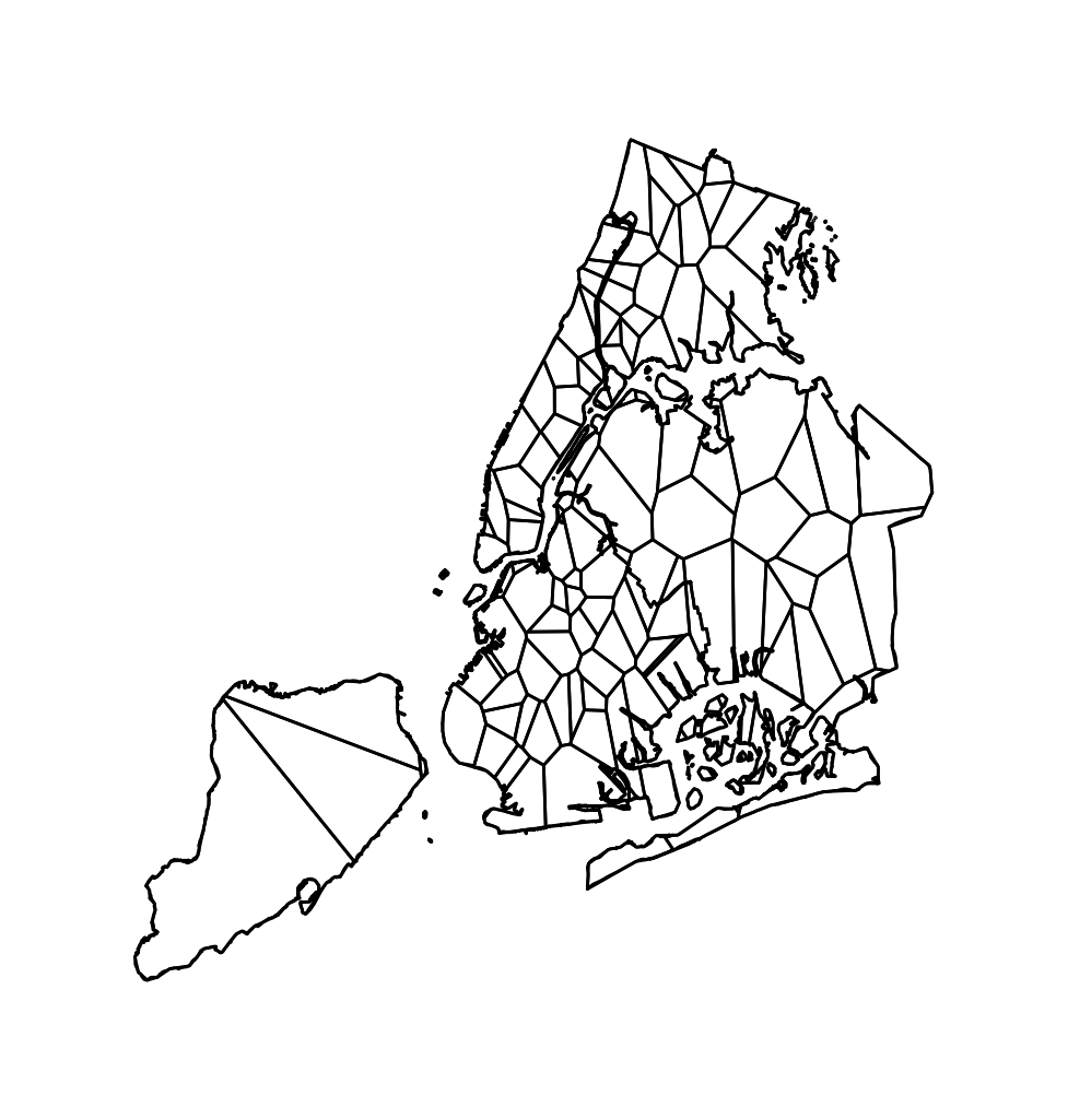
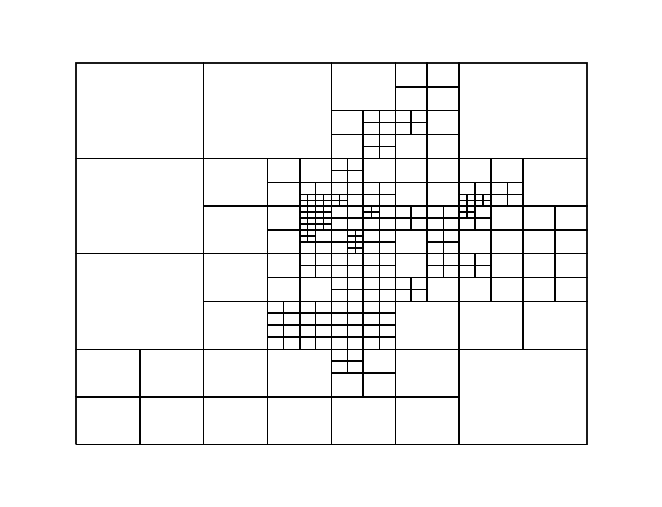
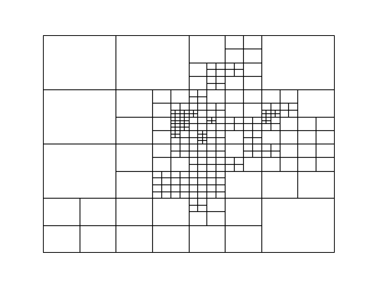
Quadtree
A quadtree is a tree data structure which splits a space into increasingly small rectangular
fractals. This plot takes a sequence of point or polygonal geometries as input and builds a
choropleth out of their centroids, where each region is a fractal quadrangle with at least
nsig observations.
A quadtree demonstrates density quite effectively. It’s more flexible than a conventional choropleth, and given a sufficiently large number of points can construct a very detailed view of a space.
A simple quadtree specifies a dataset. It’s recommended to also set a maximum number of
observations per bin, nmax. The smaller the nmax, the more detailed the plot (the
minimum value is 1).
import geoplot as gplt
import geoplot.crs as gcrs
import geopandas as gpd

boroughs = gpd.read_file(gplt.datasets.get_path('nyc_boroughs'))
collisions = gpd.read_file(gplt.datasets.get_path('nyc_collision_factors'))

gplt.quadtree(collisions, nmax=1)
(Source code, png, hires.png, pdf)
Use clip to clip the result to surrounding geometry. Note that if the clip geometry is
complicated, this operation will take a long time; consider simplifying complex geometries with
simplify to speed it up.
Keyword arguments that are not part of the geoplot API are passed to the
underlying matplotlib.patches.Patch instances, which can be used
to customize the appearance of the plot.
gplt.quadtree(
    collisions, nmax=1,
    projection=gcrs.AlbersEqualArea(), clip=boroughs.simplify(0.001),
    facecolor='lightgray', edgecolor='white'
)
(Source code, png, hires.png, pdf)

A basic clipped quadtree plot such as this can be used as an alternative to polyplot as
a basemap.
ax = gplt.quadtree(
    collisions, nmax=1,
    projection=gcrs.AlbersEqualArea(), clip=boroughs.simplify(0.001),
    facecolor='lightgray', edgecolor='white', zorder=0
)
gplt.pointplot(collisions, s=1, ax=ax)
(Source code, png, hires.png, pdf)
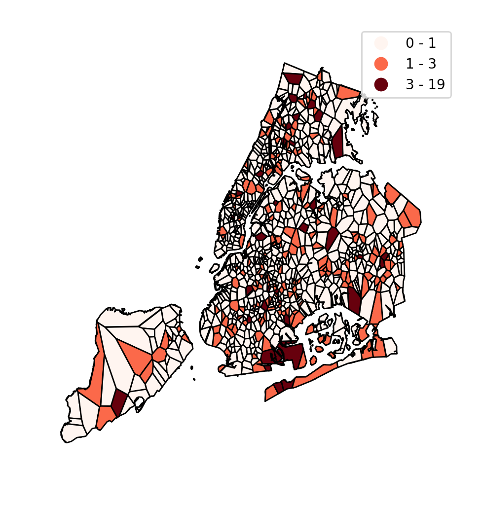
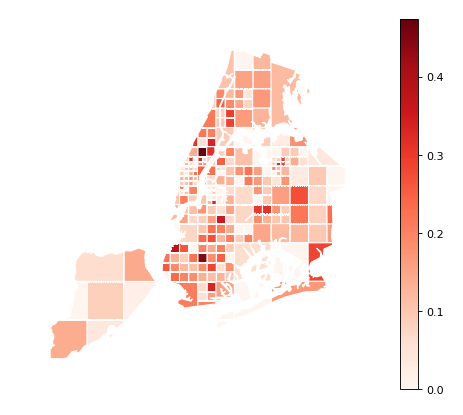
Use hue to add color as a visual variable to the plot. cmap controls the colormap
used. legend toggles the legend. The individual
values of the points included in the partitions are aggregated, and each partition is colormapped
based on this aggregate value.
This type of plot is an effective gauge of distribution: the less random the plot output, the more spatially correlated the variable.
The default aggregation function is np.mean, but you can configure the aggregation
by passing a different function to agg.
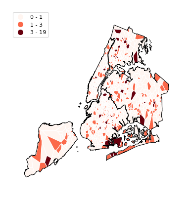
gplt.quadtree(
collisions, nmax=1,
projection=gcrs.AlbersEqualArea(), clip=boroughs.simplify(0.001),
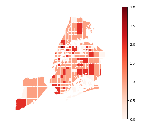
hue='NUMBER OF PEDESTRIANS INJURED', cmap='Reds',
edgecolor='white', legend=True,
)
(Source code, png, hires.png, pdf)

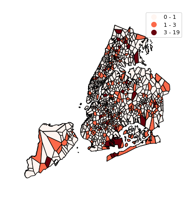
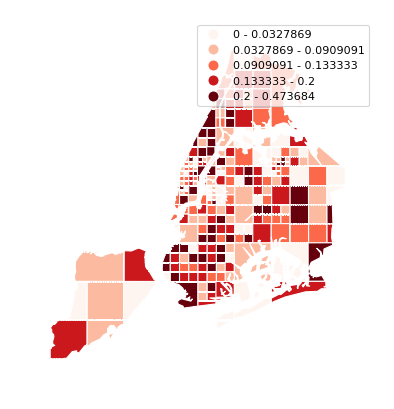
To use a categorical colormap, set scheme.
gplt.quadtree(
    collisions, nmax=1,
    projection=gcrs.AlbersEqualArea(), clip=boroughs.simplify(0.001),
    hue='NUMBER OF PEDESTRIANS INJURED', cmap='Reds', scheme='Quantiles',
    edgecolor='white', legend=True
)
(Source code, png, hires.png, pdf)

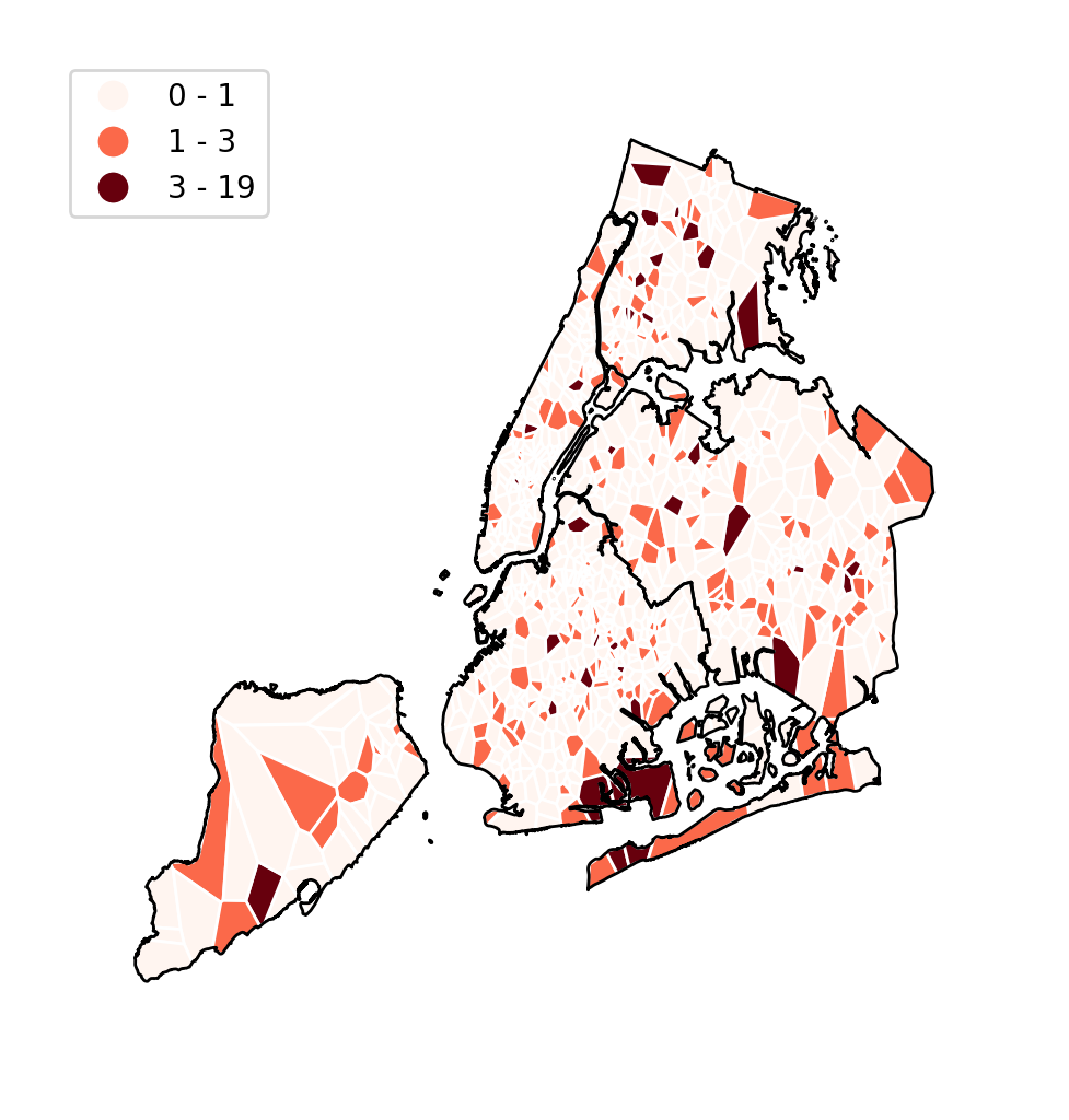
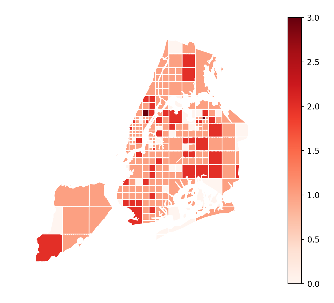
Here is a demo of an alternative aggregation function.
gplt.quadtree(
    collisions, nmax=1, agg=np.max,
    projection=gcrs.AlbersEqualArea(), clip=boroughs.simplify(0.001),
    hue='NUMBER OF PEDESTRIANS INJURED', cmap='Reds',
    edgecolor='white', legend=True
)
(Source code, png, hires.png, pdf)