Quickstart
geoplot is a geospatial data visualization library designed for data scientists and geospatial analysts that just want to get things done. In this tutorial we will learn the basics of geoplot and see how it is used.
You can run this tutorial code yourself interactively using Binder.
[1]:
# Configure matplotlib.
%matplotlib inline

# Unclutter the display.
import pandas as pd; pd.set_option('max_columns', 6)
The starting point for geospatial analysis is geospatial data. The standard way of dealing with such data in Python using geopandas—a geospatial data parsing library over the well-known pandas library.
[2]:
import geopandas as gpd
geopandas represents data using a GeoDataFrame, which is just a pandas DataFrame with a special geometry column containing a geometric object describing the physical nature of the record in question: a POINT in space, a POLYGON in the shape of New York, and so on.
[3]:
import geoplot as gplt
usa_cities = gpd.read_file(gplt.datasets.get_path('usa_cities'))
usa_cities.head()
[3]:
| id | POP_2010 | ELEV_IN_FT | STATE | geometry | |
|---|---|---|---|---|---|
| 0 | 53 | 40888.0 | 1611.0 | ND | POINT (-101.2962732 48.23250950000011) |
| 1 | 101 | 52838.0 | 830.0 | ND | POINT (-97.03285469999997 47.92525680000006) |
| 2 | 153 | 15427.0 | 1407.0 | ND | POINT (-98.70843569999994 46.91054380000003) |
| 3 | 177 | 105549.0 | 902.0 | ND | POINT (-96.78980339999998 46.87718630000012) |
| 4 | 192 | 17787.0 | 2411.0 | ND | POINT (-102.7896241999999 46.87917560000005) |
All functions in geoplot take a GeoDataFrame as input. To learn more about manipulating geospatial data, see the section Working with Geospatial Data.
[4]:
import geoplot as gplt
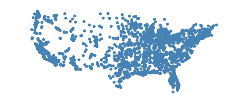
If your data consists of a bunch of points, you can display those points using pointplot.
[5]:
continental_usa_cities = usa_cities.query('STATE not in ["HI", "AK", "PR"]')
gplt.pointplot(continental_usa_cities)
[5]:
<matplotlib.axes._subplots.AxesSubplot at 0x1290c9320>
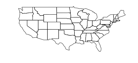
If you have polygonal data instead, you can plot that using a geoplot polyplot.
[6]:
contiguous_usa = gpd.read_file(gplt.datasets.get_path('contiguous_usa'))
gplt.polyplot(contiguous_usa)
[6]:
<matplotlib.axes._subplots.AxesSubplot at 0x1291c7128>
We can combine the these two plots using overplotting. Overplotting is the act of stacking several different plots on top of one another, useful for providing additional context for our plots:
[7]:
ax = gplt.polyplot(contiguous_usa)
gplt.pointplot(continental_usa_cities, ax=ax)
[7]:
<matplotlib.axes._subplots.AxesSubplot at 0x129a73eb8>
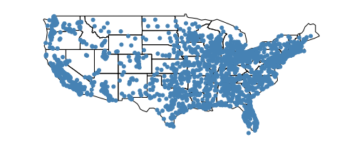
You might notice that this map of the United States looks very strange. The Earth, being a sphere, is impossible to potray in two dimensionals. Hence, whenever we take data off the sphere and place it onto a map, we are using some kind of projection, or method of flattening the sphere. Plotting data without a projection, or “carte blanche”, creates distortion in your map. We can “fix” the distortion by picking a better projection.
The Albers equal area projection is one most common in the United States. Here’s how you use it with geoplot:
[8]:
import geoplot.crs as gcrs

ax = gplt.polyplot(contiguous_usa, projection=gcrs.AlbersEqualArea())
gplt.pointplot(continental_usa_cities, ax=ax)
[8]:
<cartopy.mpl.geoaxes.GeoAxesSubplot at 0x129aec6a0>
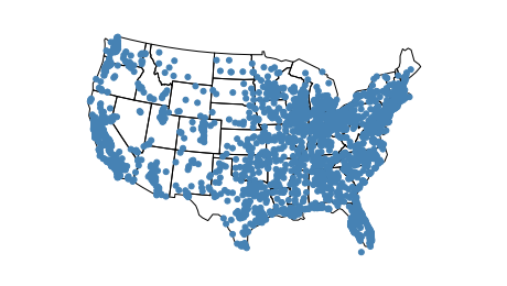
Much better! To learn more about projections check out the section of the tutorial on Working with Projections.
What if you want to create a webmap instead? This is also easy to do.
[9]:
ax = gplt.webmap(contiguous_usa, projection=gcrs.WebMercator())
gplt.pointplot(continental_usa_cities, ax=ax)
[9]:
<cartopy.mpl.geoaxes.GeoAxesSubplot at 0x129b80c18>
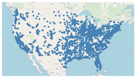
This is a static webmap. Interactive (scrolly-panny) webmaps are also possible: see the demo for an example of one.
This map tells us that there are more cities on either coast than there are in and around the Rocky Mountains, but it doesn’t tell us anything about the cities themselves. We can make an informative plot by adding hue to the plot:
[10]:
ax = gplt.webmap(contiguous_usa, projection=gcrs.WebMercator())
gplt.pointplot(continental_usa_cities, ax=ax, hue='ELEV_IN_FT', legend=True)
[10]:
<cartopy.mpl.geoaxes.GeoAxesSubplot at 0x129c42c88>
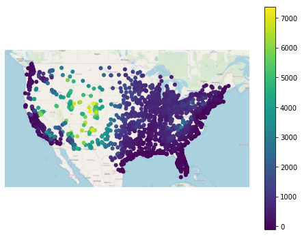
This map tells a clear story: that cities in the central United States have a higher ELEV_IN_FT then most other cities in the United States, especially those on the coast. Toggling the legend on helps make this result more interpretable.
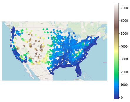
To use a different colormap, use the cmap parameter:
[11]:
ax = gplt.webmap(contiguous_usa, projection=gcrs.WebMercator())
gplt.pointplot(continental_usa_cities, ax=ax, hue='ELEV_IN_FT', cmap='terrain', legend=True)
[11]:
<cartopy.mpl.geoaxes.GeoAxesSubplot at 0x12c8642b0>
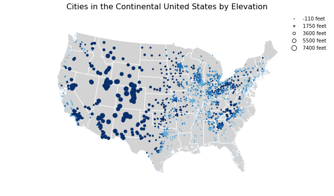
geoplot comes equipped with a broad variety of visual options which can be tuned to your liking.
[12]:
ax = gplt.polyplot(
    contiguous_usa, projection=gcrs.AlbersEqualArea(),
    edgecolor='white', facecolor='lightgray',
    figsize=(12, 8)
)
gplt.pointplot(
    continental_usa_cities, ax=ax, hue='ELEV_IN_FT', cmap='Blues',
    scheme='quantiles',
    scale='ELEV_IN_FT', limits=(1, 10),
    legend=True, legend_var='scale',
    legend_kwargs={'frameon': False},
    legend_values=[-110, 1750, 3600, 5500, 7400],
    legend_labels=['-110 feet', '1750 feet', '3600 feet', '5500 feet', '7400 feet']
)
ax.set_title('Cities in the Continental United States by Elevation', fontsize=16)
/Users/alex/miniconda3/envs/geoplot-dev/lib/python3.6/site-packages/scipy/stats/stats.py:1633: FutureWarning: Using a non-tuple sequence for multidimensional indexing is deprecated; use `arr[tuple(seq)]` instead of `arr[seq]`. In the future this will be interpreted as an array index, `arr[np.array(seq)]`, which will result either in an error or a different result.
  return np.add.reduce(sorted[indexer] * weights, axis=axis) / sumval
[12]:
Text(0.5, 1.0, 'Cities in the Continental United States by Elevation')
Let’s look at a couple of other plot types available in geoplot (for the full list, see the Plot Reference).
[13]:
gplt.choropleth(
    contiguous_usa, hue='population', projection=gcrs.AlbersEqualArea(),
    edgecolor='white', linewidth=1,
    cmap='Greens', legend=True,
    scheme='FisherJenks',
    legend_labels=[
        '<3 million', '3-6.7 million', '6.7-12.8 million',
        '12.8-25 million', '25-37 million'
    ]
)
[13]:
<cartopy.mpl.geoaxes.GeoAxesSubplot at 0x12cb5e128>
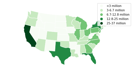
This choropleth of population by state shows how much larger certain coastal states are than their peers in the central United States. A choropleth is the standard-bearer in cartography for showing information about areas because it’s easy to make and interpret.
[14]:
boroughs = gpd.read_file(gplt.datasets.get_path('nyc_boroughs'))
collisions = gpd.read_file(gplt.datasets.get_path('nyc_collision_factors'))

ax = gplt.kdeplot(collisions, cmap='Reds', shade=True, clip=boroughs, projection=gcrs.AlbersEqualArea())
gplt.polyplot(boroughs, zorder=1, ax=ax)
/Users/alex/miniconda3/envs/geoplot-dev/lib/python3.6/site-packages/scipy/stats/stats.py:1633: FutureWarning: Using a non-tuple sequence for multidimensional indexing is deprecated; use `arr[tuple(seq)]` instead of `arr[seq]`. In the future this will be interpreted as an array index, `arr[np.array(seq)]`, which will result either in an error or a different result.
  return np.add.reduce(sorted[indexer] * weights, axis=axis) / sumval
[14]:
<cartopy.mpl.geoaxes.GeoAxesSubplot at 0x12f173ac8>
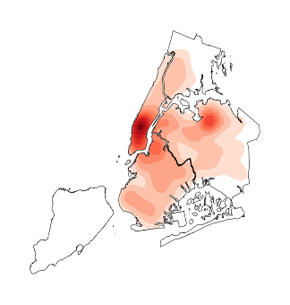
A kdeplot smoothes point data out into a heatmap. This makes it easy to spot regional trends in your input data. The clip parameter can be used to clip the resulting plot to the surrounding geometry—in this case, the outline of New York City.
You should now know enough geoplot to try it out in your own projects!
To install geoplot, run conda install geoplot. To see more examples using geoplot, check out the Gallery.